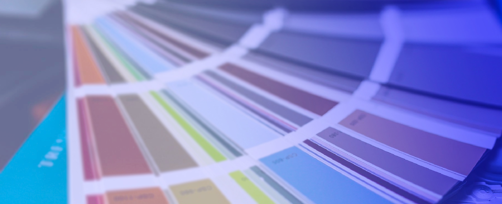
The Pantone color system was invented by advertising agent Lawrence Herbert in the 1950s and was formalized for commercial use in the 1960s.
The Pantone system is commonly used in graphic design, fashion, cosmetics, and high-end printing for accurate color-matching.
Each color in the Pantone system is assigned a unique numerical code known as a Pantone Matching System (PMS) number, enabling businesses to generate exact color matches for branding.
The Pantone system contains 1,867 solid colors, each assigned a unique three-number code followed by either "C" (coated) or "U" (uncoated) to indicate paper type.
Pantone is chosen when extreme accuracy in color reproduction is needed, or if a brand's logo contains unique colors that can't be easily reproduced using other methods.
Pantone, or spot color printing, uses ready-mixed ink to print true colors directly, providing a more solid look. CMYK printing builds up layers of different colored dots and may result in variations.
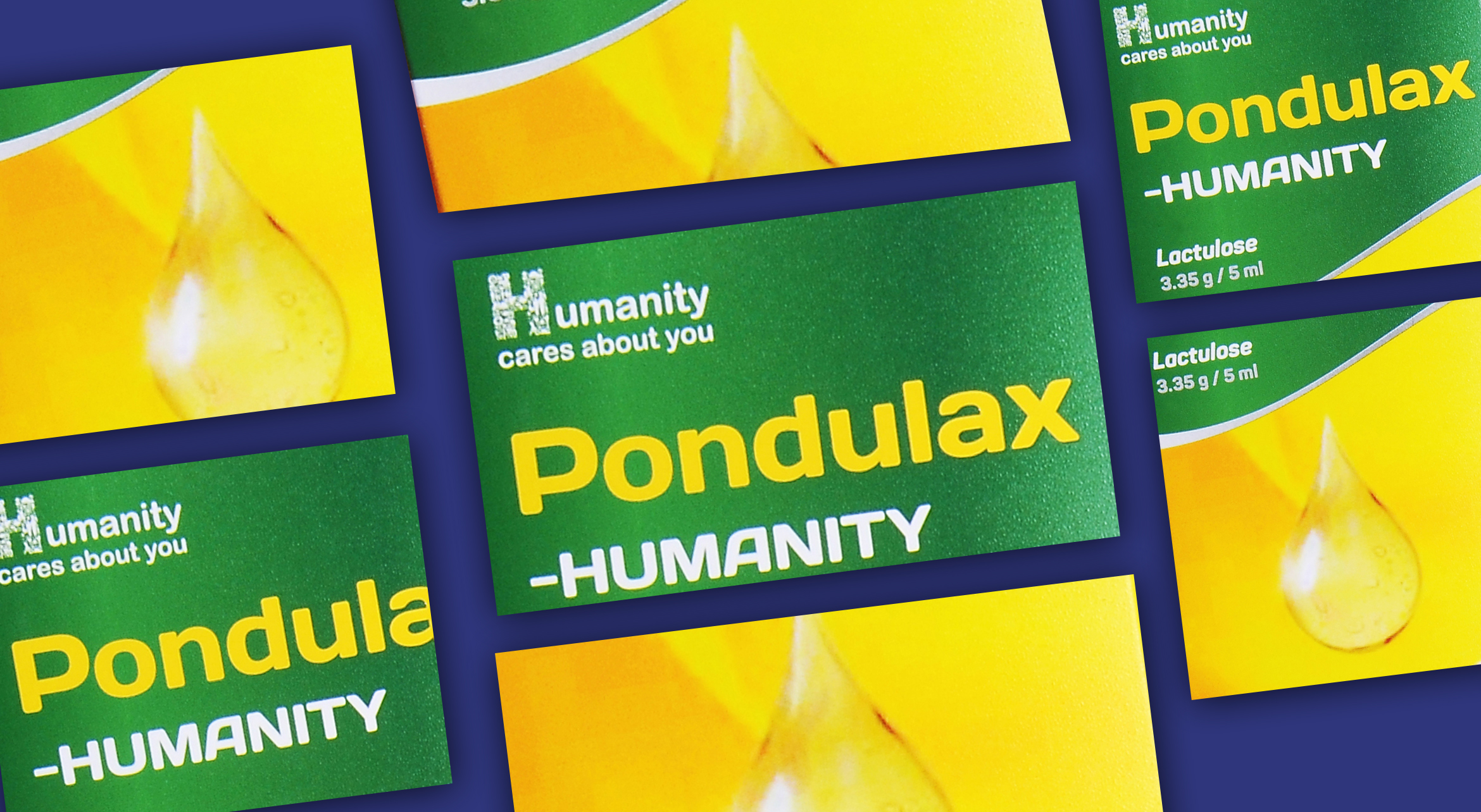
Pantone color printing ensures perfectly mixed colors, and highly consistent color reproduction, and is ideal for maintaining the same color across packaging for quality and branding consistency.
Pantone printing can be more costly and time-consuming than CMYK printing. However, it offers greater color accuracy and consistency.
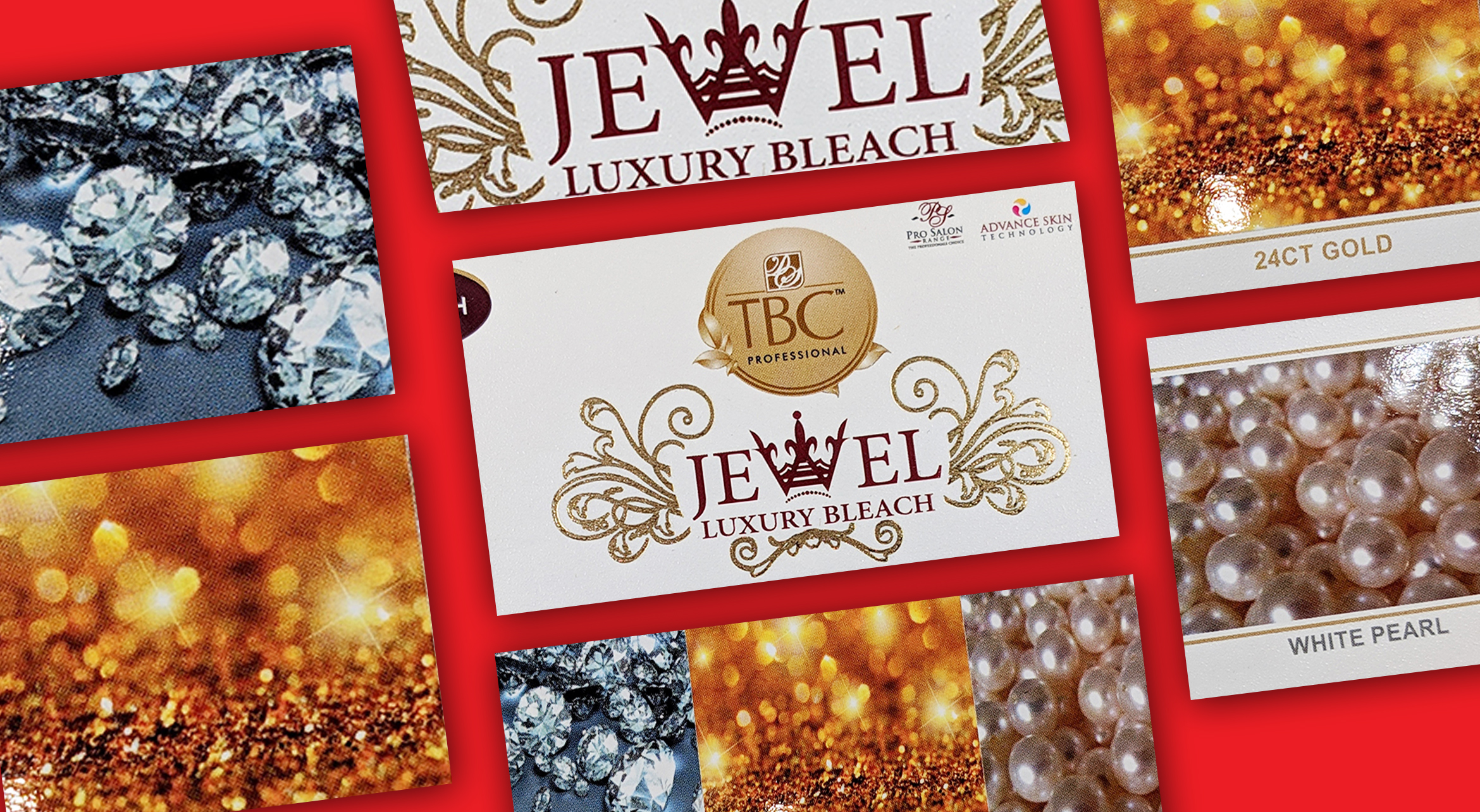
Pantone includes metallic shades recognizable by an "8" at the beginning of the code. Pastel and neon colors have codes starting with "9" and are available in both coated and uncoated versions.
To prepare artwork in Adobe Illustrator, open the Swatches palette, select the Pantone book, generate a color palette, and apply the colors to vector graphics using the Selection Tool. Export the files as high-quality PDFs.
